
BRAND
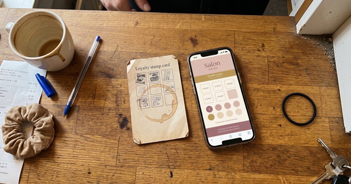
The generic stamp card is a branding problem
If the card looks exactly like the neighbour's, it'll be remembered like the neighbour's. Here's how to stand out.
You've spent years making your place exactly that. The sign, the colours, the smell when someone walks in, how the staff greet people, how the menu is laid out. It all hangs together.
And then you hand over a stamp card that looks like a stamp card from a random petrol station in a small town.
It's not a small thing. It's a communication to the customer about how much care you put in – and most customers read it automatically, even if they don't put it into words.
Your brand is the sum of every touchpoint
In brand strategy there's a fundamental concept: your brand isn't what you say you are – it's the sum of every single experience a customer has with you. Logo, tone, colours, packaging, tablecloths, bags, receipts, emails. And yes, the stamp card.
A generic stamp card says two things to the customer without you meaning to. It says: "This isn't really a part of us, it's a sideline." And it says: "We didn't put time into this piece."
Both signals erode what you've built up elsewhere.
Why it affects more than you think
There's an effect in consumer psychology called consistency bias. People find it easier to engage with and stay loyal to brands that feel consistent across all touchpoints.
A customer who has just had a fantastic experience in your salon, and then gets a stamp card that could equally have come from anywhere, gets a creeping feeling that what she just experienced maybe isn't quite as unique as it felt.
The two ways to solve it
Option one: build your own from scratch. Design a card that matches your overall graphic profile. It's the most expensive route – you need a designer and a printer.
Option two: pick a system that lets you customise. Modern digital stamp cards have built-in design tools where you swap logo, colours, background image, font and tone yourself.
Cecilia at SARACECILIA explains: "It was important for us that the card would feel like a natural part of SARACECILIA, both in expression and tone."
What is not an acceptable option is a system that shows their logo instead of yours.
Four things the card should carry of your brand
The colour. If your shop is calm and muted, the card shouldn't be screaming neon yellow.
The typography. Same font family as on signs and menus.
The imagery. An image from your own business always beats stock photography.
The tone of the messages. When the card sends an SMS to the customer, the text should sound like you, not like a template.
Summary
The generic stamp card isn't a neutral tool. It's a touchpoint that either strengthens or erodes your brand. The solution isn't necessarily expensive – modern systems let you customise nearly everything to your own profile – but the decision to do it has to be made consciously.
See how brand-consistent cards drive engagement. Explore PayAtt's design customization →